

Understanding Positioning in CSS
A complete guide to the CSS position property, with examples.


Getting into the CSS position property can be a bit challenging. Trust me, this is from experience. Back when I started with CSS, the position property seemed so complicated, so otherworldly, that it was with immense trepidation that I used it at all. Why? It was because I did not fully understand the concept.
So without further ado, this article aims to demystify this formidable property using beginner-friendly terms. And at the end of the day, like me, you’ll realize that it isn’t that big a deal after all. But first, the prerequisites.
Prerequisites
This article satisfies every stage of Frontend developers. Hence, It comes with a fresh view and unique understanding of the topic, serving as a handy reference that one can always fall back on.
However, so we are on the same page, here are the basic requirements for this article:
A basic understanding of HTML and CSS—their rules and basic syntax.
A code editor of your choice—practice makes perfect.
Why use it?
Cascading Style Sheets(CSS) is a webpage styling language. And one quality that has kept it as the go-to styling language is its flexibility. The flexibility in question stems from the plethora of available options, giving numerous solutions to styling problems. One such solution is the position property.
You see, with adequate knowledge of this concept, arranging elements on a webpage becomes a piece of cake. It not only allows you to specify the exact location of elements using basic commands like top, left, right, and bottom but also allows the stacking of elements one atop the other using the z-index property.
Basic Terminology
Before heading into the various positioning methods, here are some essential concepts you should know:
Position: Static - The default position
CSS being such a high-level language uses an easy-to-follow syntax. Hence, for most CSS terms, deductions can be made using just their dictionary meanings
Upon hearing that an object is static, what comes to mind is that it doesn't move. Right? Yes, that is true. Applying that logic in styling terms: Static elements cannot be displaced using the top, left, right, bottom, and z-index properties. They are essentially immobile and follow the normal flow of the webpage.
Position: Static; is the default position applied to all elements on a webpage and would need to be changed to gain complete control over the location of an element.
Top, Left, Right, and Bottom
These specify the distance from the border of the parent element. For example, top:0; means the element is zero pixels away from the top border of the parent element, and hence stays attached to it. While right:3px; means the element is three pixels away from the right border of the parent element.
Note that:
They only work on positioned elements. Positioned elements employ any positioning method but
position: static;.Asides from pixels, you can use other units for positioning, such as rem, em, percentages, and so on.
In addition to this, you can still adjust positioned elements using their margin and padding properties.
Z-index
Now, I'm sure you are familiar with your x and y-axis. The z-axis is another such axis. And the easiest way to visualize it is as a line going through your screen, from front to back.
The z-axis can be utilized in CSS so elements can be stacked over themselves in a particular order. This stacking order is specified using the z-index property.
Furthermore, the larger(or more positive) a value assigned to the z-index is, the closer it is to the front of the screen, and vice versa. There is no unit for the z-index.
The z-index property only works on:
Positioned elements
Grid elements and their children
Flex elements and their children

Stacking using z-index
Viewport
Your viewport is the portion of a webpage visible to you at any time. It is determined by the size of your device’s screen.
One can target the viewport in styling so elements are positioned relative to it. Targeting the viewport gives a more unified position for elements across devices.
With all that covered, we can now move on to the various positioning methods outlined below.
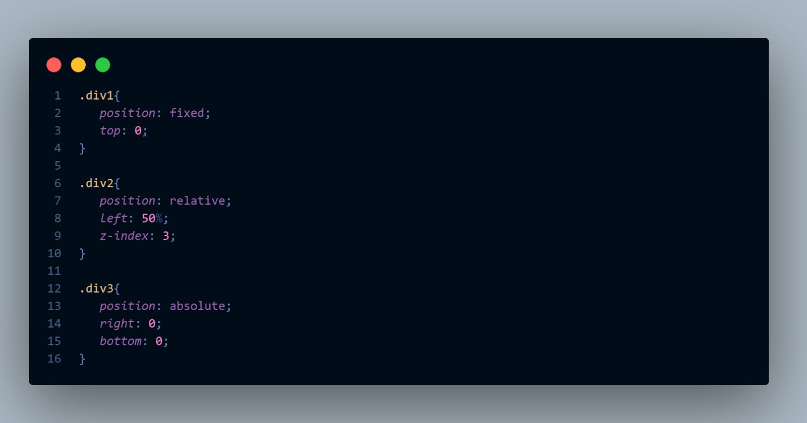
Relative positioning
An element with position: relative; is positioned relative to its initial position. Hence, top:3rem; moves the element three rem downwards from its initial position.
However, a space is left behind, as though the element never moved. This space exists because the element still follows the normal flow of the webpage. Hence, no other elements move to fill this space.
Note that all positioned elements automatically float over other static elements. This feature can be changed using the z-index property.
Absolute positioning
This method can be problematic for some, especially if they do not fully understand its characteristics.
Get this. All position: absolute; elements are positioned relative to the viewport. However, if contained in a positioned parent element(container), It is positioned relative to this container.
In this example, the parent container with its position set to relative houses the absolute element. Notice how the purple box stays within its container. This method is your most likely use case for the position: absolute;.
Note that all position: absolute; elements:
Are removed from the normal flow of the page. Hence, other elements move up to take their place.
Do not interfere with other elements on a webpage. This is the floating behavior, and can be seen in pop-up notifications.
Fixed positioning
As the name implies, this positioning method fixes an element to a specified position on a webpage.
Fixed positioning is closely related to Absolute positioning. But unlike its cousin, Fixed positioning is always positioned relative to the viewport, regardless of the positioning method of the parent container.
Notice how the fixed bar(in purple) remains fixed to the viewport even after scrolling the page downwards.
Position: fixed; elements, like position: absolute; elements, are also removed from the normal flow of the webpage.
Sticky positioning
As a relatively recent addition, sticky positioning brings solutions previously unavailable to CSS. Its ability is, however, marred by delayed browser support and unconvinced developers.
Sticky-positioned elements start just like any position: relative; element, keeping its normal flow. This behavior remains until you reach a certain offset during scrolling. At this point, the element switches to a position: fixed; behavior, where it sticks to a specified position.
Notice how the purple box followed the normal flow of the webpage, until it was just about disappearing from our view. It then stuck in place and became a floating element, not unlike the fixed bar earlier discussed.
Note that:
For
position: sticky;to work, there must be adequate room so the element can scroll.To enable scrolling, place
position: sticky;elements in parent containers with either a specifiedheightproperty or enough content and aheightset toauto.
Conclusion
Css positioning, as you seen so far, isn't so hard, all you have to do is get familiar with it. And this familiarity is only possible with practice. Give yourself new problems and new iterations of problems. Solving them opens your eyes to the numerous possibilities and design options made available through this property.
I hope you found this article helping. If you did, consider dropping a like, and spread the word.
Till we meet again.🖤